Chromatic essence
Coherence, balance and versatility in every collection
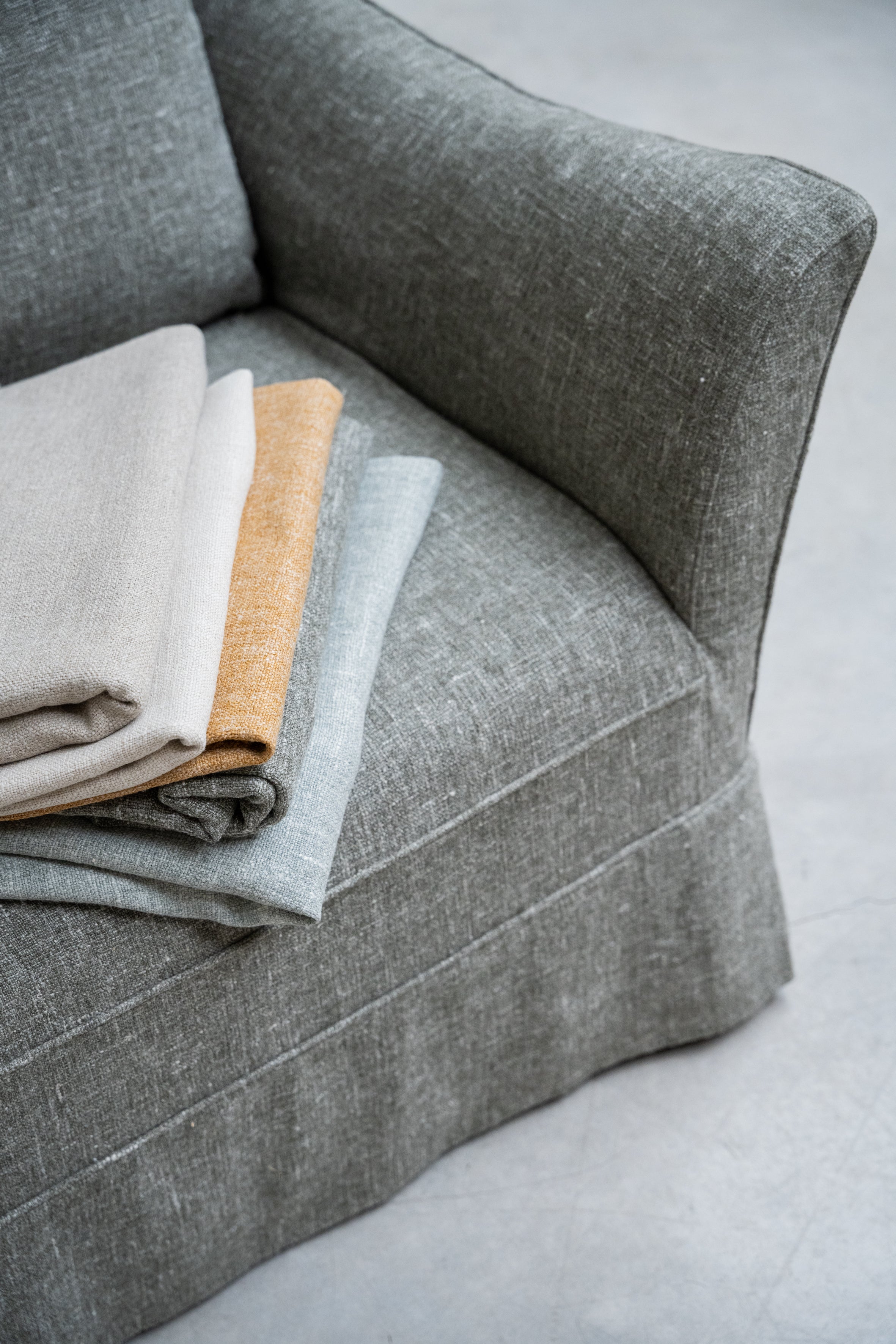
The chromatic essence of Serendipity is built on coherence.
Each fabric has been selected to dialogue with the others, allowing natural and balanced combinations within a single project. Our palette encourages the layering of textures and nuances, creating harmonious and versatile compositions.
These are colours that evoke landscapes and places that linger in the memory. Tones that suggest moments and experiences without imposing themselves, capable of bringing either character or serenity depending on the intention of the space.
This chromatic coherence forms the foundation that unifies all our collections.
Nature as the origin
Our foundation, our identity
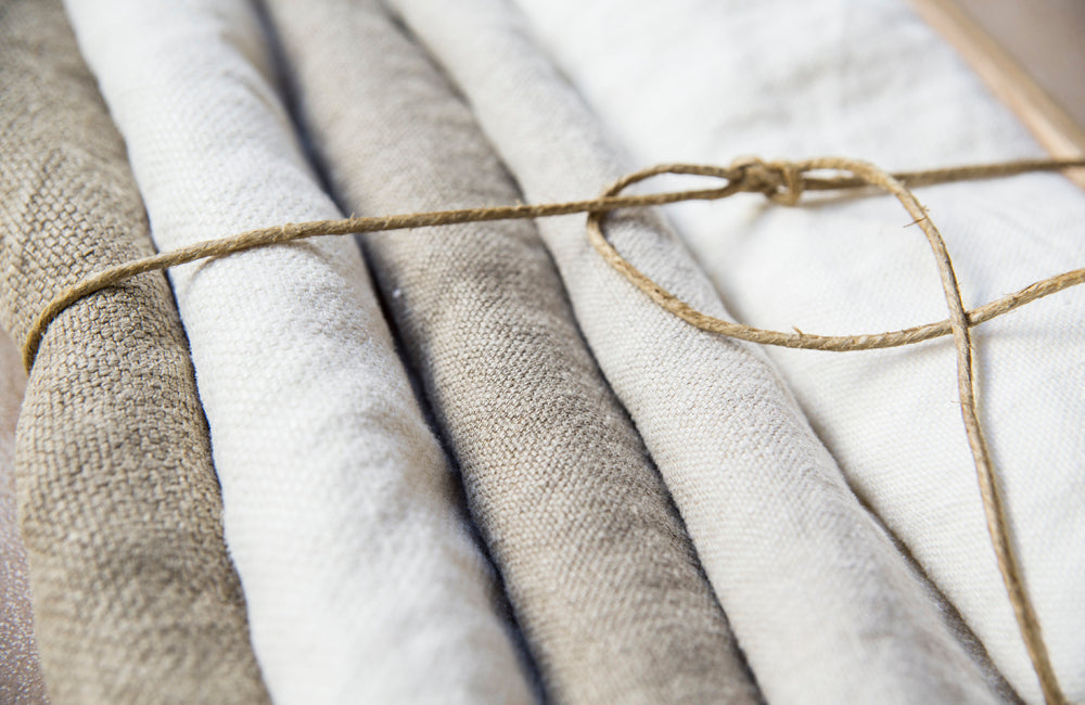
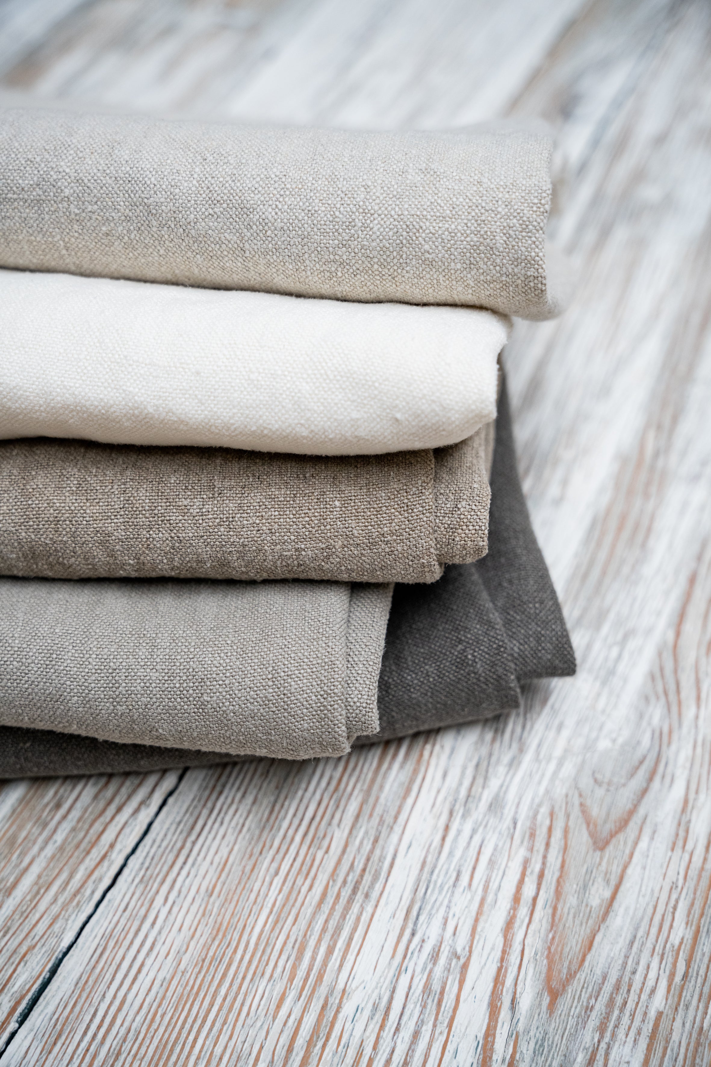
The identity of Serendipity is rooted in a palette of natural tones.
Colours that breathe calm and balance: soft sands, off-whites, mineral greys and earthy browns. This range forms the foundation of our textile language — the common thread present throughout all our collections.
These are tones that naturally dialogue with architecture and noble materials — stone, wood and linen — allowing the creation of serene and timeless spaces.
They transcend trends and seasons because they are born from the earth itself.
Restrained. Universal. Enduring.
These natural colours are the essence of Serendipity.

Depth and character
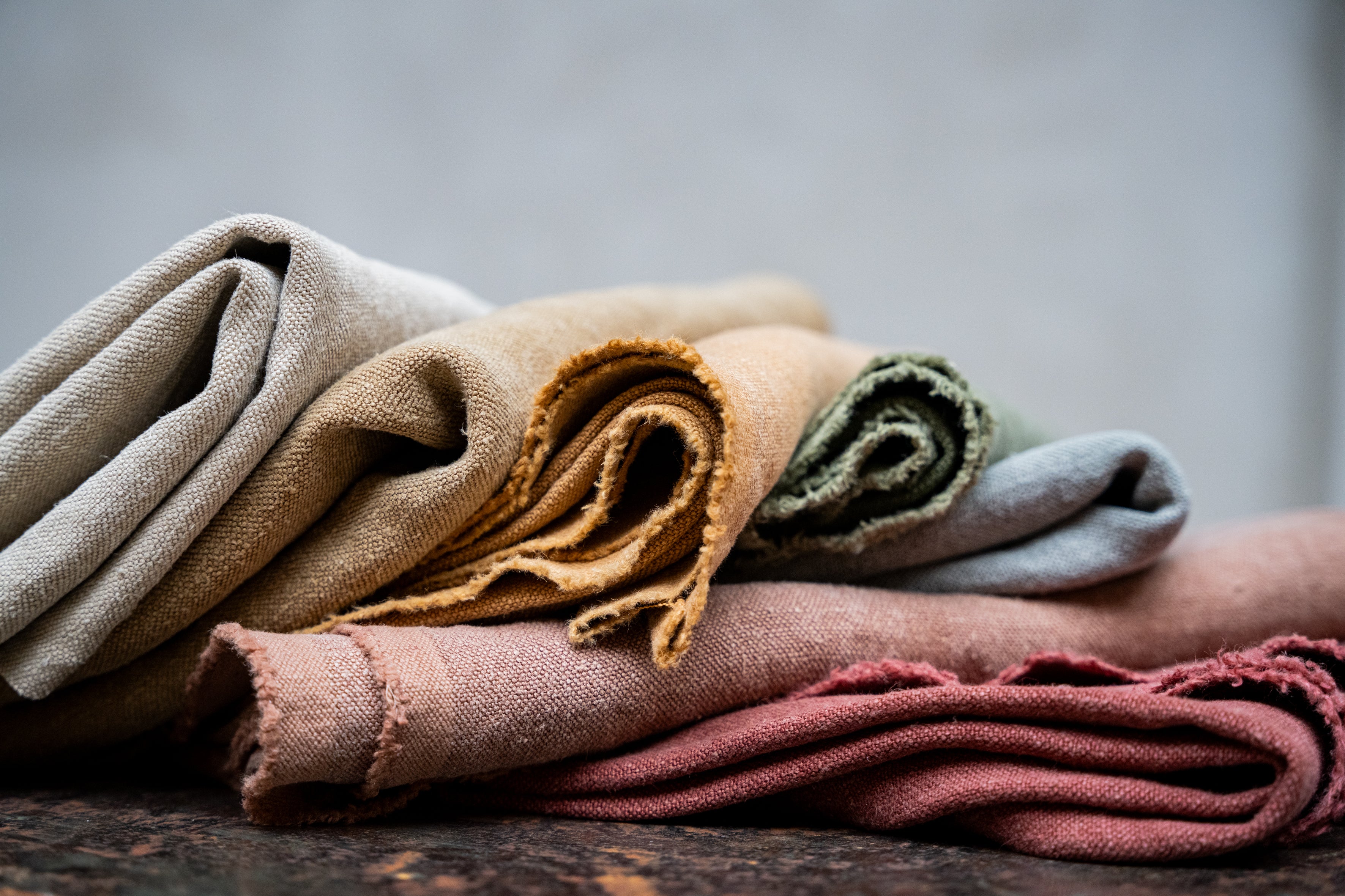
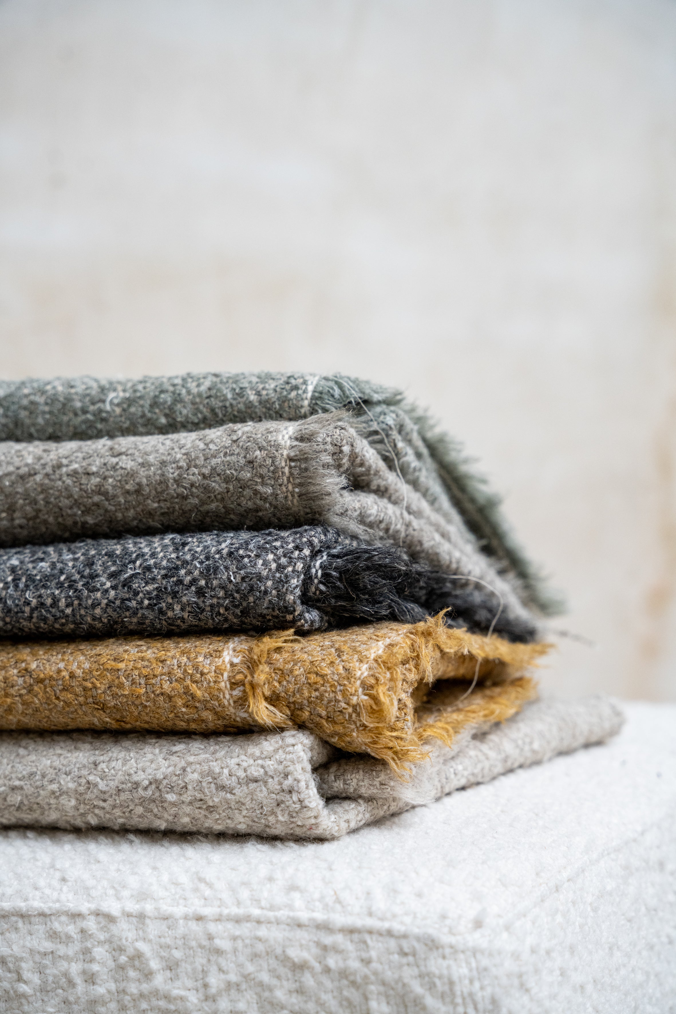
Ochre, terracotta, green, brown and grey: depth that accompanies
Building on our natural foundation, we introduce tones that add structure and contrast. Subtle nuances that enrich the palette and allow for more defined compositions without losing harmony.
Ochre
Antelope, sand, camel and warm beige
The selection includes a range that moves from soft golden tones to deeper, toasted nuances.
It brings luminosity and character to upholstery, cushions or curtains, particularly in spaces where warmth is desired without excess.
A colour chosen for its versatility and its ability to enrich natural palettes.
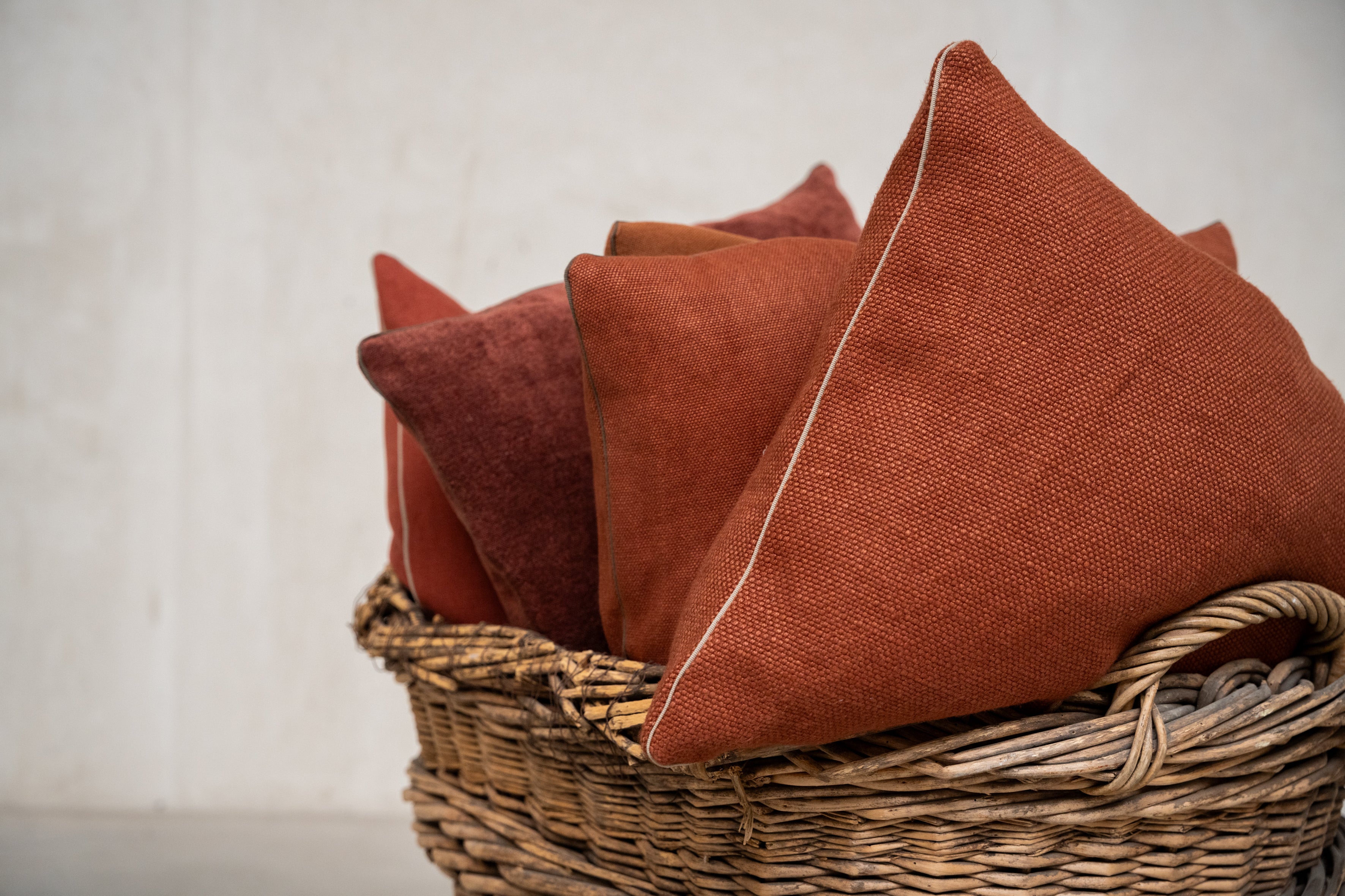
Terracotta
Brick, copper, sienna, burnt orange and deep red
A warm, mineral tone that brings depth and character to a space without becoming dominant.
Terracotta works particularly well in statement upholstery, generously draped curtains, or pieces designed to introduce contrast within a neutral palette.
It has been chosen for its ability to introduce structural warmth into contemporary interiors, balancing materials such as stone, natural wood and pale lime finishes.
A colour that adds dimension and a sense of grounding without losing sophistication.
Green
Sage, olive and forest
The range extends from sage and olive to deeper forest tones.
It allows natural contrast to be introduced into neutral bases while reinforcing warm or earthy schemes.
A colour included for its versatility and for its ability to bring balance and serenity to the overall composition.
Brown
Earth, coffee, chocolate and walnut
The range of browns extends from toasted sand tones to deeper, more enveloping shades.
It introduces structure and stability to a space, particularly in pieces designed to bring visual weight and balance.
It has been included for its ability to create a sense of grounding and continuity, reinforcing a warm and serene atmosphere without losing sophistication.
Grey
Mineral grey, stone and anthracite
Greys structure the palette and bring visual balance.
From light, mineral tones to more defined anthracite shades, they allow for soft contrasts while reinforcing the architecture of the space.
Chosen for their versatility and their ability to bring serenity and coherence to any project.
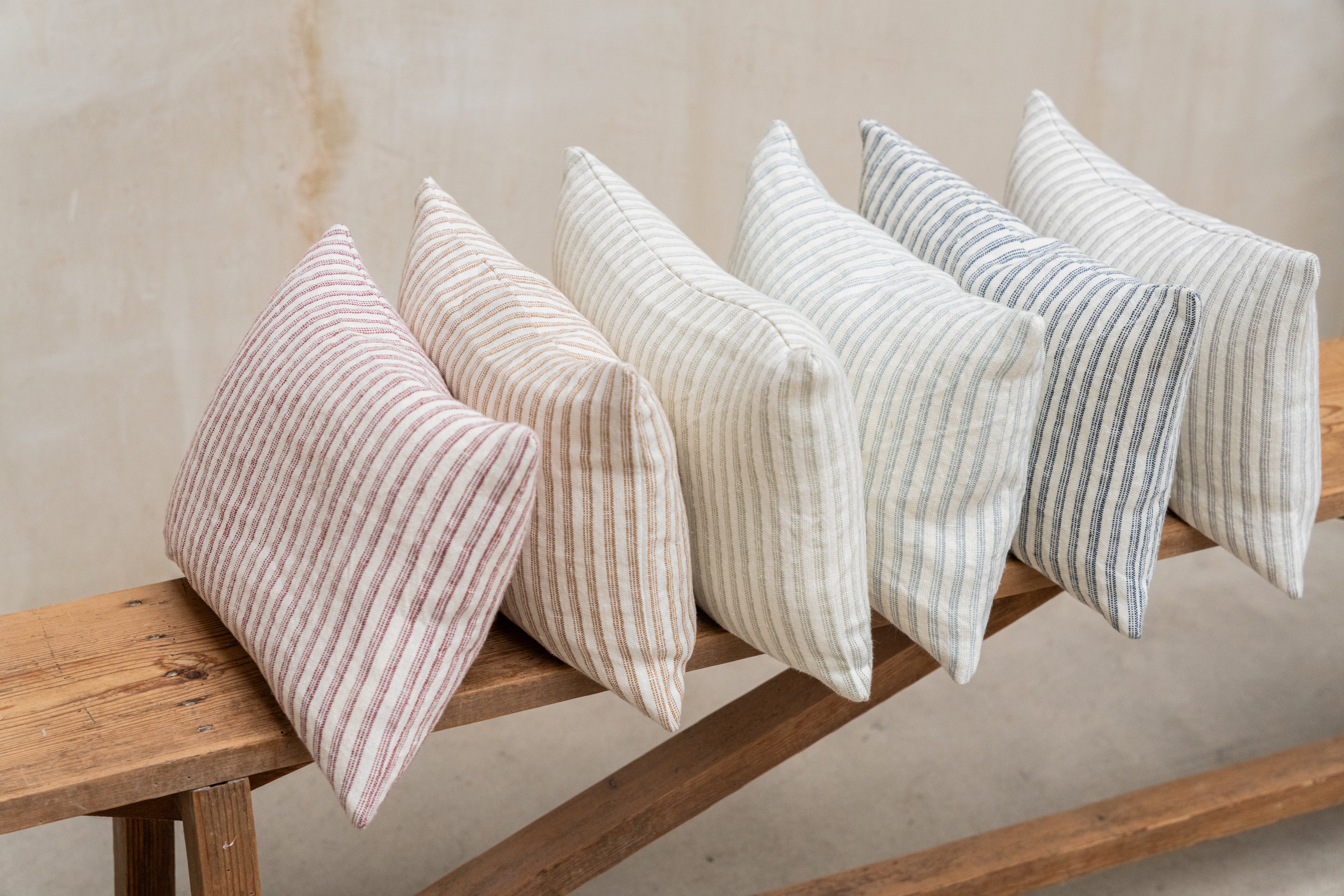
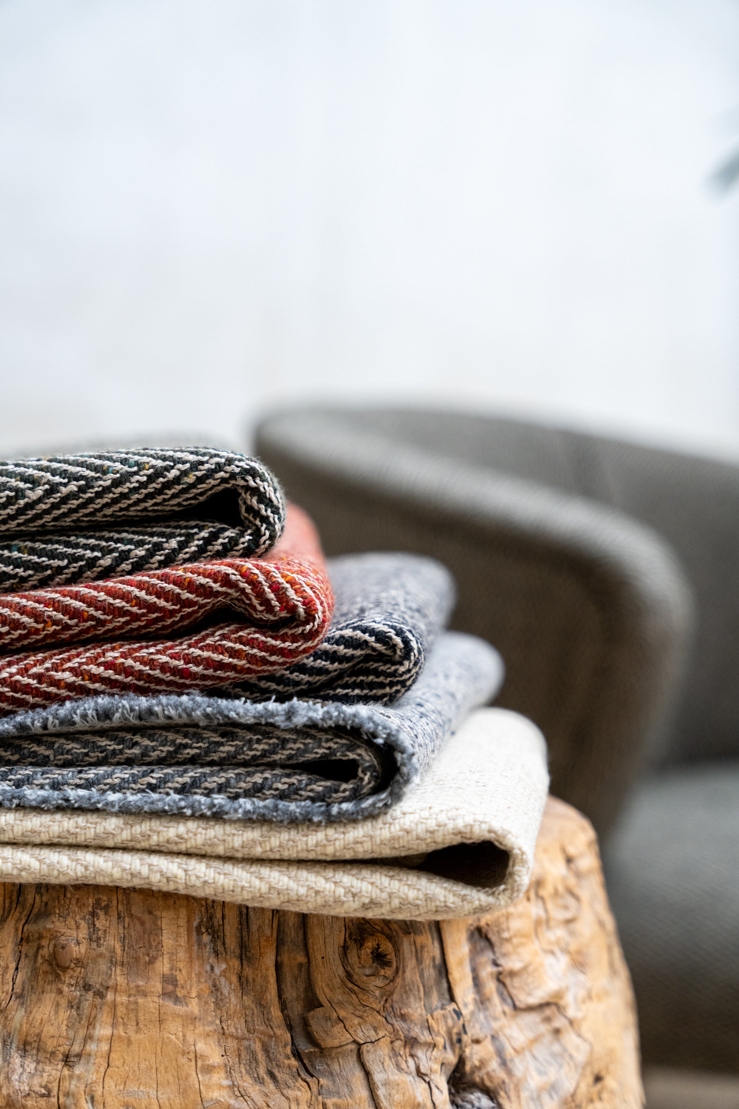
Stripes: a quiet rhythm
Our collections include striped fabrics that bring rhythm and structure to a composition.
Integrated within our chromatic palette, they introduce contrast and dynamism while maintaining coherence with the rest of the fabrics.
They reinterpret traditional references through a contemporary perspective, bringing character and a timeless aesthetic.
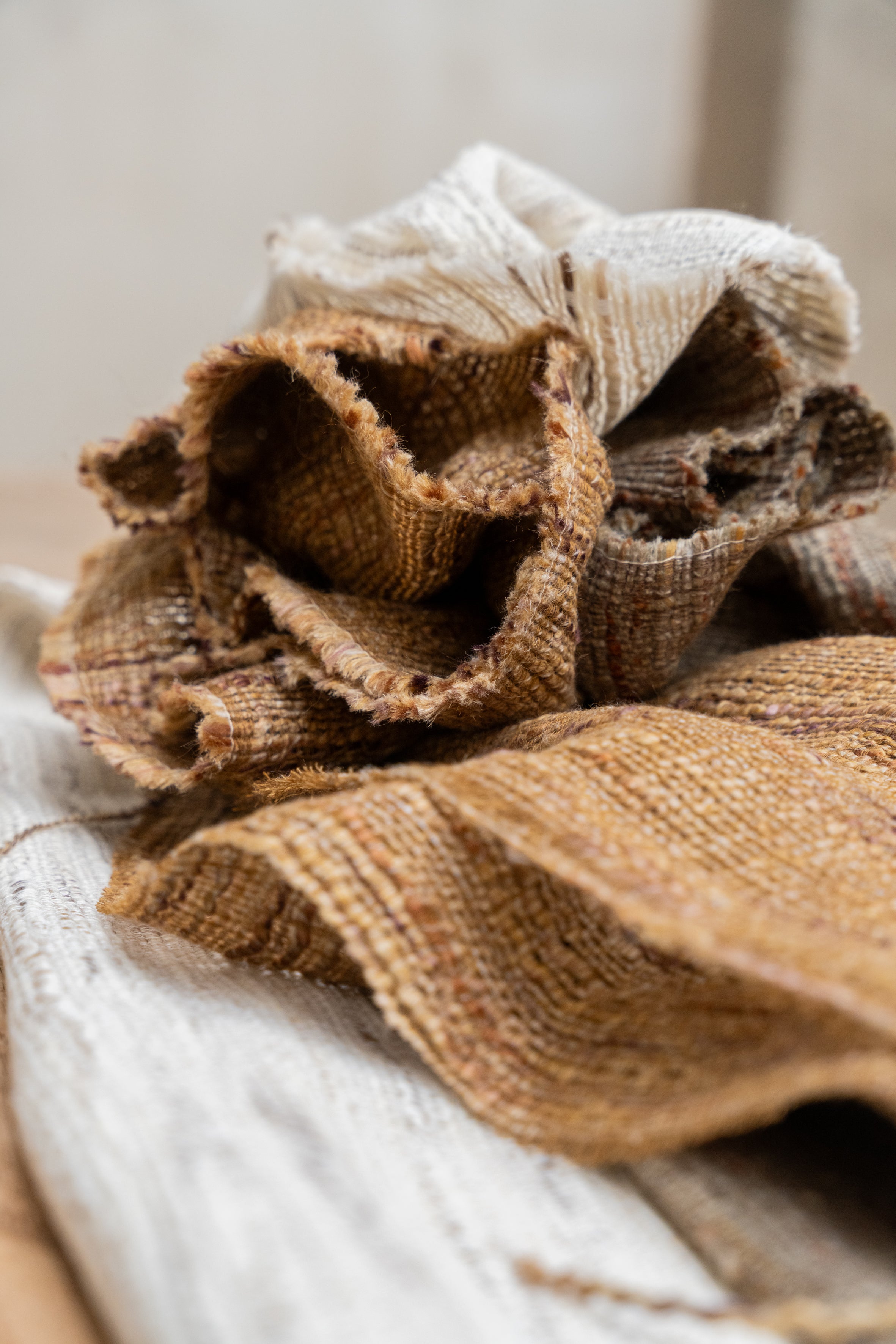
Herringbone: natural geometry
Herringbone is a classic structure reinterpreted through a contemporary sensibility.
It brings rhythm, depth and a subtle texture that visually organises the space. Integrated within our palette, it introduces character without disrupting harmony.
A timeless geometry that reinforces Serendipity’s textile identity.
A chromatic language that transcends time
It is more than a selection of tones.
It is the way we structure each collection and ensure coherence between fabrics, textures and finishes. Our palette is built from a natural and balanced foundation, designed to facilitate fluid combinations and harmonious compositions within a single project.
These are colours that evoke landscapes and places that remain in the collective memory. Essential tones that bring character when needed, or serenity when the space requires it.
A chromatic essence that defines the identity of Serendipity and connects all our collections with coherence and enduring continuity.